Mastering Class Variance Authority (CVA) in React
This article explains what Class Variance Authority (CVA) is and how to use it with Tailwind CSS in React applications.
Prerequisites: A basic understanding of React, JavaScript/TypeScript, and Tailwind CSS.
Table of Contents
- Core Concepts: How CVA works
- Core Concepts: The cva() function
- Installation
- Passing the variant props to the component
- Javascript vs. TypeScript Usage
- Summary & Quick Reference Cheat Sheet
Take a look at these buttons:
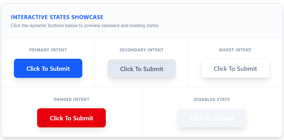
These are the various iterations of a button component intended to convey different intents (primary, secondary, danger, ghost, disabled).
To accomplish these different iterations, you might write code like this:
import React from "react"; import { cn } from "../../src/utils";

// 1. You have to manually write & sync TypeScript types for every variant option export type ButtonIntent = "primary" | "secondary" | "danger" | "ghost"; export type ButtonSize = "full" | "cut";

export interface ButtonProps extends React.ButtonHTMLAttributes { intent?: ButtonIntent; size?: ButtonSize; isDisabled?: boolean; isLoading?: boolean; }

export function ActionButton({
  intent = "primary",
  size = "cut",
  isDisabled = false,
  isLoading = false,
  className,
  children,
  onClick,
  ...props
}: ButtonProps) {
  const handleclick = (e: React.MouseEvent<HTMLButtonElement>) => {
    if (isLoading || isDisabled) return;
    onClick?.(e);
  };

  // 2. The Naive Approach: Constructing the string manually using template literals
  const baseStyles =
    "font-semibold flex justify-around items-center shadow-lg dark:shadow-[inset_0_1px_0_0_rgba(255,255,255,0.1)] gap-2 rounded-md py-2 px-5 md:min-w-35 md:w-auto md:gap-2.5 md:rounded-lg md:py-2.5 md:px-6 lg:min-w-40 lg:w-auto lg:gap-3 lg:rounded-lg lg:py-3 lg:px-8 active:scale-95";

  const intentStyles =
    intent === "primary"
      ? "border bg-btn-primary-bg border-btn-primary-border !text-btn-primary-text hover:bg-btn-primary-bg-hover active:bg-btn-primary-bg-active"
      : intent === "secondary"
      ? "dark:shadow-[inset_0_1px_0_0_rgba(255,255,255,0.3)] bg-btn-secondary-bg !text-btn-secondary-text hover:bg-btn-secondary-bg-hover active:bg-btn-secondary-bg-active"
      : intent === "danger"
      ? "border bg-btn-danger-bg border-btn-danger-border !text-btn-danger-text hover:bg-btn-danger-bg-hover active:bg-btn-danger-bg-active"
      : "border bg-btn-ghost-bg border-btn-ghost-border !text-slate-500 hover:bg-btn-ghost-bg-hover active:bg-btn-ghost-bg-active"; // ghost

  const sizeStyles = size === "full" ? "w-full md:w-full lg:w-full" : "";

  const disabledStyles = isDisabled
    ? "bg-btn-disabled-bg text-btn-disabled-text border-0 pointer-events-none"
    : "";

  const loadingStyles = isLoading
    ? "!text-transparent relative bg-white border-2 pointer-events-none"
    : "";

  return (
    <button
      disabled={isDisabled || isLoading || props.disabled}
      className={cn(
        `${baseStyles} ${intentStyles} ${sizeStyles} ${disabledStyles} ${loadingStyles}`,
        className
      )}
      onClick={handleclick}
      ...props
    >
      {children}
    </button>
  );
}
This works, but it introduces some major engineering problems:
Poor Readability: The code is cluttered and quickly becomes difficult to read.
High Maintenance Risk: Updating those nested ternary operators is tedious and allows too many opportunities to introduce errors.
Lack of Type Safety: Passing invalid variant strings is very likely, and they will fail silently at compile time.
CSS Specificity Conflicts: It creates a mess of unhandled class overrides and unpredictable specificity bugs.
This might seem like a quandary. Afterall, CSS, JS, and their various libraries and frameworks do not provide any means to more efficiently handle situations like this where conditional styling is necessary. This is the issue that Class Variance Authority was made to address.
Class Variance Authority (CVA) is a lightweight utility library that you can use to conditionally construct the classes of your UI Components. This makes it especially ideal for developers using Tailwind. CVA also provides automatic typesafety when using Typescript.
Installation
To start, install CVA with your preferred package manager:
# npm
npm install class-variance-authority

# pnpm
pnpm add class-variance-authority

# bun
bun add class-variance-authority

# yarn
yarn add class-variance-authority

# deno
deno add class-variance-authority
Core Concepts: How CVA works
CVA accomplishes its conditional class construction through the use of variants. You define different variants (e.g., size, intent) which should determine how the component is styled. These variants are objects which map the options for that variant as keys directly to Tailwind/CSS class strings. When the component is being rendered, CVA merges the class strings of the variant options which are passed to the component into a single string which is then passed as the className of the component instance.
Core Concepts: The cva() function
The cva() function is the primary utility in the CVA library. It is used to define these variants and the base styles of the component. To import it into your code, type:
import { cva } from "class-variance-authority";
Then call the function and assign it to a variable:
const buttonVariants = cva()
You define the base styles in a string or an array of strings in the function. After that, you define a config object. The config object will contain the variants, variant options, and Tailwind/CSS class strings.
 const buttonVariants = cva(
  [
    "font-semibold",
    "flex",
    "justify-around",
    "items-center",
    "shadow-lg",
    "dark:shadow-[inset_0_1px_0_0_rgba(255,255,255,0.1)]",
    "gap-2",
    "rounded-md",
    "py-2",
    "px-5",
    "md:min-w-35",
    "md:w-auto",
    "md:gap-2.5",
    "md:rounded-lg",
    "md:py-2.5",
    "md:px-6",
    "lg:min-w-40",
    "lg:w-auto",
    "lg:gap-3",
    "lg:rounded-lg",
    "lg:py-3",
    "lg:px-8",
    "active:scale-95",
  ],
  {
    variants: {
      intent: {
        primary: [
          "border",
          "bg-btn-primary-bg",
          "border-btn-primary-border",
          "!text-btn-primary-text",
          "hover:bg-btn-primary-bg-hover",
          "active:bg-btn-primary-bg-active",
        ],
        secondary: [
          "dark:shadow-[inset_0_1px_0_0_rgba(255,255,255,0.3)]",
          "bg-btn-secondary-bg",
          "!text-btn-secondary-text",
          "hover:bg-btn-secondary-bg-hover",
          "active:bg-btn-secondary-bg-active",
        ],
        danger: [
          "border",
          "bg-btn-danger-bg",
          "border-btn-danger-border",
          "!text-btn-danger-text",
          "hover:bg-btn-danger-bg-hover",
          "active:bg-btn-danger-bg-active",
        ],
        ghost: [
          "border",
          "bg-btn-ghost-bg",
          "border-btn-ghost-border",
          "!text-slate-500",
          "hover:bg-btn-ghost-bg-hover",
          "active:bg-btn-ghost-bg-active",
        ],
      },
      size: {
        full: ["w-full", "md:w-full", "lg:w-full"],
        cut: [""],
      },
      isDisabled: {
        true: [
          "bg-btn-disabled-bg",
          "text-btn-disabled-text",
          "border-0",
          "pointer-events-none",
        ],
        false: [""],
      },
  }
);
Compound & Default Variants
The config object can also contain two other keys called compoundVariants and defaultVariants. Compound Variants allow you to apply classes when a specific combination of multiple variants is active at the same time. For example, we might make the button invisible if intent is ghost and disabled is true
compoundVariants: [
      {
        intent: "ghost",
        isDisabled: true,
        className: "opacity-0 pointer-events-none",
      },
    ],
Default Variants define what variant options should be passed to the component by default in the event that a particular variant prop is not explicitly passed by the program.
defaultVariants: {
      intent: "primary",
      size: "cut",
      isDisabled: false,
    },
In the end that leaves us with this:
const buttonVariants = cva(
  [
    "font-semibold",
    "flex",
    "justify-around",
    "items-center",
    "shadow-lg",
    "dark:shadow-[inset_0_1px_0_0_rgba(255,255,255,0.1)]",
    "gap-2",
    "rounded-md",
    "py-2",
    "px-5",
    "md:min-w-35",
    "md:w-auto",
    "md:gap-2.5",
    "md:rounded-lg",
    "md:py-2.5",
    "md:px-6",
    "lg:min-w-40",
    "lg:w-auto",
    "lg:gap-3",
    "lg:rounded-lg",
    "lg:py-3",
    "lg:px-8",
    "active:scale-95",
  ],
  {
    variants: {
      intent: {
        primary: [
          "border",
          "bg-btn-primary-bg",
          "border-btn-primary-border",
          "!text-btn-primary-text",
          "hover:bg-btn-primary-bg-hover",
          "active:bg-btn-primary-bg-active",
        ],
        secondary: [
          "dark:shadow-[inset_0_1px_0_0_rgba(255,255,255,0.3)]",
          "bg-btn-secondary-bg",
          "!text-btn-secondary-text",
          "hover:bg-btn-secondary-bg-hover",
          "active:bg-btn-secondary-bg-active",
        ],
        danger: [
          "border",
          "bg-btn-danger-bg",
          "border-btn-danger-border",
          "!text-btn-danger-text",
          "hover:bg-btn-danger-bg-hover",
          "active:bg-btn-danger-bg-active",
        ],
        ghost: [
          "border",
          "bg-btn-ghost-bg",
          "border-btn-ghost-border",
          "!text-slate-500",
          "hover:bg-btn-ghost-bg-hover",
          "active:bg-btn-ghost-bg-active",
        ],
      },
      size: {
        full: ["w-full", "md:w-full", "lg:w-full"],
        cut: [""],
      },
      isDisabled: {
        true: [
          "bg-btn-disabled-bg",
          "text-btn-disabled-text",
          "border-0",
          "pointer-events-none",
        ],
        false: [""],
      },
    },
    defaultVariants: {
      intent: "primary",
      size: "cut",
      isDisabled: false,
    },
    compoundVariants: [
      {
        intent: "ghost",
        isDisabled: true,
        className: "opacity-0 pointer-events-none",
      },
    ],
  }
);
This function returns a string that you can pass as the class of the component when it is rendered.
Passing the variant props to the component
Defining the variants is fine, but for them to construct a class string, the component needs to actually receive the variants as props. Developers using typescript will find the VariantProps utility type indispensable for type annotation. It extracts the type of the variants object. This ensures that the compiler accepts only correct inputs as variant values.
First, import VariantProps from cva:
import { cva, VariantProps } from "class-variance-authority";
Use it to get the type of the variants and store them in a variable
export type ButtonVariant = VariantProps<typeof buttonVariants>
Create an interface which will be used to annotate the props of the component. It must have the types for all standard button props as well as the variants.
export interface ButtonProps
  extends ButtonVariant, React.ButtonHTMLAttributes<HTMLButtonElement> {}
Doing this comes with three immediate advantages from a Developer Experience perspective:
Instant Autocomplete. When typing in VS Code, as soon as you open quotes (""), VS Code suggests "primary", "secondary", "danger", and "ghost". You don't have to check the stylesheet to remember what variants exist.
Compile-Time Error Prevention: Catches typos (e.g., intent="primry") immediately in your IDE before running code.
Zero Maintenance Syncing. If you add a new variant inside your buttonVariants schema, VariantProps instantly updates the type definition across your entire codebase. We can now build the component with the necessary props:
export function ActionButton({
  intent = "primary",
  size = "cut",
  isDisabled = false,
  className,
  children,
  onClick,
  ...props
}: ButtonProps) {
  const handleClick = (e: React.MouseEvent<HTMLButtonElement>) => {
    if (isDisabled) return;
    onClick?.(e);
  };

  return (
    <button
      disabled={isDisabled || props.disabled}
      className={buttonVariants({ intent, size, isDisabled })}
      onClick={handleClick}
      {...props}
    >
      {children}
    </button>
  );
}
Javascript vs. TypeScript Usage
Of course, you do not need TypeScript to use CVA. In plain JavaScript, omit VariantProps and interface definitions entirely. Simply accept your props and pass them into buttonVariants(...). Far less typesafe, but it works.
export function ActionButton({
  intent = "primary",
  size = "cut",
  isDisabled = false,
  className,
  children,
  onClick,
  ...props
}) {
  const handleClick = (e) => {
    if (isDisabled) return;
    onClick?.(e);
  };

  return (
    <button
      disabled={isDisabled || props.disabled}
      className={buttonVariants({ intent, size, isDisabled })}
      onClick={handleClick}
      {...props}
    >
      {children}
    </button>
  );
}
Summary & Quick Reference Cheat Sheet
For quick reference, here's a table of CVA's key features:
| Feature | Syntax | Purpose |
|---|---|---|
| Base Styles | cva("font-semibold flex justify-around items-center shadow-lg", ...) |
Core styles applied across all instances. |
| Variants | variants: { intent: { primary: "..." } }} |
Define unique styles per property. |
| Defaults | defaultVariants: { intent: "primary" } |
Applied when props are undefined. |
| Compound | compoundVariants: [{ intent: "ghost", isDisabled: true, className: "..." }] |
Style specific variant combinations. |
| Type Extractor | VariantProps<typeof variants> |
Generates TypeScript props automatically. |
Note on Class Overrides & Merge Conflicts:
In production design systems, you often want to accept an external className prop to merge custom styles or resolve Tailwind specificity conflicts (e.g., using clsx and tailwind-merge). I'll cover how to set up the cn() helper utility in a follow-up article!